Stat Goals and Graphs

Ask Mr. Robot uses a more advanced technique to value stats on you gear than traditional stat weights or a simple stat priority. It ranks gear much better, but it is also a bit harder to understand why the optimizer chooses certain items sometimes.

We have updated the way that we display stats to help show you what is going on under the hood. (Note: these views might now show up on the site for you until the 7.2.5 patch, but putting this post here today for reference.)

#Stat Goals
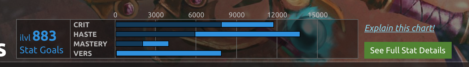
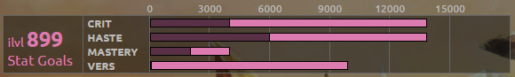
Above each section on the gear optimizer page is a little chart that shows what we call “stat goals”. It looks like this:

So what is this telling you? In this example:

All combinations of stats that are within 1% of the best possible combination have:

  • Crit between ~4000-14000
  • Haste between ~6000-14000
  • Mastery between ~2000-4000
  • Versatility between ~0-10000

This example has a pretty wide range! There are a lot of stat combinations that are very close in value. That’s OK! It just means that Crit, Haste, and Vers are very close in value for this character, so you have a lot of flexibility to shift between the three stats.

Note that for NPS, it shows ranges within 4% of the best combination. This is because it is a different kind of metric that fluctuates more and has a different scale than DPS or HPS.

#Stat Graphs
If you click the “See Full Stat Details” button that appears next to the stat goal charts on the gear optimizer, it brings up a more detailed graph that looks like this:

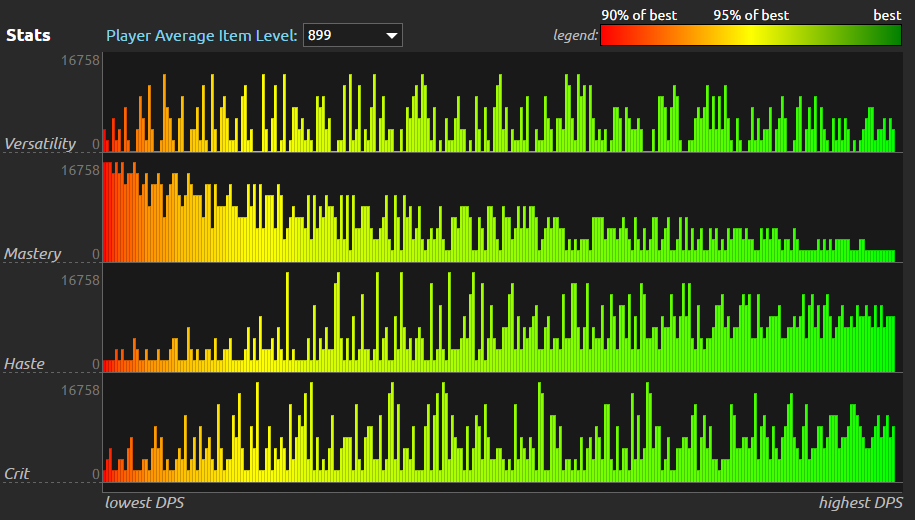
So what is this telling me? In this example:

There are a couple hundred different combinations of Crit, Haste, Mastery, and Versatility shown here. Each combination is a thin column. You can mouse over any colored bar to get a tooltip with the actual numbers. The colors tell you how far off from the best combo a bar is: red means you would lose 10% or more DPS. Yellow means you would lose 5% DPS or so. Green is the best: the others are ranked against those.

By graphing all of these combos, we can visualize the general trends of which stat combinations are good or bad:

  • High Mastery combinations are on the left in red: they tend to be the worst, and can cause you to lose as much as 10% DPS.
  • Combinations with a balance around 10k each of Crit and Haste, with a little Versatility are on the right in green: they tend to be the best.
  • There’s a lot of green on this chart! That means there are a lot of viable stat combinations for this character.

Note that for tanks the color scale is 80% to 100% rather than 90% to 100%. Otherwise the graph tends to be all red. NPS is a different kind of metric with a different scale, so trying to always shoot for within 1% of max is unnecessarily restrictive on your gear choices.

#Why this instead of Stat Weights or Priorities?
As you can see in this data, there are relationships between stats that make your DPS go up or down. If we went with the “traditional” stat weight approach and just said Haste > Crit > Vers > Mastery… it would stack Haste way too high. Look at that chart… all the really high Haste columns are in the middle-left, creeping into yellow and orange. You don’t want that!

You want a good balance of Crit and Haste, and that is what the Ask Mr. Robot approach excels at finding.

###What about getting new Stat Weights every time I change gear?
This example data shows how that doesn’t always work out either… it can get you “stuck” in a pretty good but not best setup. In this example data, you can see how really low Crit builds can be pretty good if you have a decent chunk of Haste and also add a lot of Versatility. Now if your Crit is really low… if you generated traditional stat weights, there’s a good chance it would tell you Versatility is the best. Once your Crit is that low… you’re better off stacking up more Versatility. You’re committed to that path, no turning back! And you also have no hope of getting to those better setups.

The Ask Mr. Robot approach doesn’t have this limitation. We can “see” this entire graph in the optimizer, and that dropping most of your Versatility and picking up a ton of Crit to compensate is a slightly better move.

5 Likes

Please expand a little on this section like what the colours mean and what we should aim for. Should the dark part of the bars all look approximately even? Are the dark part of the bars our values vs the optimal values in light blue?

I read this section a few times and I’m still not clear on what the graph means unfortunately.

3 Likes

The colored-in sections (that aren’t faded) are the target range for your stats, where the better combinations of stats tend to lie for your spec/character. e.g. in the image above, it’s saying that the better gear combinations have haste between around 6000 to 13,500.

I think you could get rid of the dark region that is to the left of each bright bar. It doesn’t mean anything since no one is “targeting” having too little of a stat.

If you were going to show a dark region, it should be meaningful like an expanded upper/lower band. (ie, 1% within the bright band and 2% within the dark band, both directions).

The idea is that you can look at it as simple bars to see which one is longest (best stat). And then the colored-in range tells you how much “play” you have on that stat – narrower means that more specific combos of stats work better for that spec, wider means that lots of combos work better.

My chart:

Am I within the optimal ranges? I re-read what you said a few times on each of your replies but I still don’t get it. Are you saying that my actual values should be within the lighter coloured ranges?

1 Like

The ranges are values for each stat that you might find in the top 1% of simulation results. If the gear you have available, for instance, only has mastery, then you wont be able to get within that zone, but it demonstrates the stat distributions the optimisation algorithm is “looking for”. If you are within all 4 light blue ranges, then your gear is very well itemized relative to the gearing strategy. In reality, where your stats fall will depend on what you have in your bags.

I get what you are trying to say; but it frankly doesn’t seem like the normal way a graph would be presented. The magnitude is obvious just from the axis having numbers.

I would expect a graph of this sort to be portrayed as follows:

The light blue bar would be “very good” (within 1%), the dark blue bar would be “okay” (within 1.5%), and the red line would be your current stats. In the example, I put one of the red lines outside the bars to show how it would look with a player who was not geared very well.

Areas to the left would not be shaded in at all, because they are “not so good” (by more than 1.5%).

In this example I fudged versatility to show a dark blue bar on the left; but if you used real sim data it would be possible that the light blue bar goes all the way to zero because its still within the 1% margin.

14 Likes

Sure – that could be another way to show it. I don’t think there’s really any “normal” way to do it though… as long as it conveys the information clearly.

We’ll wait and see what other kind of feedback we get. Most people have been big fans of it so far. I think these are the only two instances we’ve had so far of people not quite following it. We’ll see if more start coming in and adjust if necessary.

I completely agree that the example ddcorkum suggests would help many players understand the information at it relates to their current gear and optimized range for each stat. Understanding what the optimal range it one thing, Showing players where they stand in relationship to them is the other component, and the red line helps players see how close they are to the limits of a range in the event they need to increase or decrease another stat.

6 Likes

IMO - you need to add something that is more distinctive of when a stat is not meeting the requirements. If that was explained, I clearly missed it which means the current iterative of graphing does not inform me enough. Honestly, I really don’t get stat weights or sim crafting gear when I have 910 level gear in my bags that is worse overall then an 895 piece. I really don’t think casual to semi-hardcore raiders can count on a graphing system with such disparaging differences between ilvl gear and the stat priorities each of these pieces carry for 14 different slots. I spent well over 3 hours using SimCraft and Pawn along with AMR simcraft on so many pieces of gear, I just got fed up and said whatever. My simple response to this entire problem is bring back Reforging, if the answer or solution moving forward is to go through all of this to properly stat a character. Reforging is much easier, and then make a guild perk for reforging, pretty simple and really what most players will likely use to improve their toons stats. just my opinion, I’m sure it will be debated.

I don’t see stat goals anywhere in the gear optimizer page? I must be blind - EDIT found it, you have to run best in bags FIRST to see that…kinda dumb but whatever

1 Like

Once we do our next update soon, it won’t be so “dumb” – we’ll be using sometimes up to hundreds of different gearing strategies to optimize your gear. We won’t be able to show the stat goals until you optimize because… we won’t know which strategy it ended up using until the optimization is complete!

This would be a perfect way to show it and would make it much easier to see where you stood

2 Likes

I honestly still don’t understand what the darker shade is. I read where you say that you are well optimized if your stats are within the lighter shade, but what does the darker shade represent? Is the whole bar representing the top 1% of sim results or just the lighter color? What % does the darker shade represent, if not the top 1%? Also, what is NPS?

1 Like

We’re gathering feedback and may tweak things when we get some time, but for now just roll with it:

At its simplest, think of it as a horizontal bar chart: the longest bar is generally your best stat, the shortest is your worst.

Then, at the “tip” of each bar, is a colored-in range that shows you how “wide” the range on that stat is for combinations in the top 1% – or in other words, you could have a set of gear with stats anywhere in that range and still be within 1% of optimal.

And @rulem search the forum or our blog for NPS, we have some articles describing it. It is a tanking metric that we developed for Legion.

A post was split to a new topic: Unexpected Stats from Best in Bags

I agree with ddcorkum, please do this.

3 Likes

Another helpful improvement could be adding an arrow or a similar mark in the “full stat details” graph, just to show where in that 10% range you are currently placed, if you are. And also another way to show if you are not there.

Is all this process taking legendaries and set bonuses into consideration?

While i don’t realy understand this whole thing yet i do want to point is that as a collorblind person its realy hard to see the difference between the orange, yellow and green so maybe a option to make that more clear would be nice.